One of looking at this is that European banners, coats of arms, etc, are traditionally defined in writing (often using a domain-specific language called a blazon), and then compiled to a visual form by a banner maker. This compilation is intended to be reversible -- one goal is to be able to look up the written form in a book of heraldry based on the visual appearance -- but, just like compiling code, is not a one-to-one process; the same blazon can result in various visual representations, and which one is selected is often an aesthetic consideration.
Not speaking Italian, and not having done the historical digging, I don't know the original written definition of the Vatican flag, but it looks like it's something like "banner divided in yellow (towards the flagpole) and white, with the white part centered with the crossed keys surmounted by the tiara," where the "crossed keys" and "tiara" are imports of external symbology. In this case, the question concerns the tiara [1] -- which, like most physical tiaras, has a hole running through it that appears neither red nor white when viewed as it is represented on the flag.
While it is certainly reasonable for the Vatican to have preferences on the detailed representation of this flag, both as-drawn versions are faithful representations of the blazon, both allow looking up the blazon from the visual representation, and both are, frankly, fine.
Now of course you can't draw keys and tiara with Euclid-style instructions (in practice), but maybe countries should standardize their flag by publishing a canonical SVG file.
Turkish constitution defines Turkish flag in terms of geometry. The founder of our republic was a mathematics enthusiast. He also had a book on teaching geometry although his main profession was being a soldier.
While the svg does have a standard rfc, imagine the rfc gets changed to invalidate the standard, and your flag is altered (or svg become incompatible). A technical drawing with ratios and CMY(K)/Pantone coloring would be a proper fit, though.
> “The heraldic scholar A. C. Fox-Davies proposed that, in some circumstances, white should be considered a heraldic colour, distinct from argent”
I took a look, just because Fox-Davies can be absurdly and amusingly pedantic about that stuff:
He only postulates White as tincture for labels of cadency – as in the CoA of the Prince of Wales. The idea is to difference it from argent. The supporters of the PoW’s CoA are a lion or and the unicorn argent – both with a label. If the label was argent it would be a violation of the rule of tinctures for the lion and without distinction from the unicorn.
Heraldic rules should apply to flags, insofar as it is centuries of graphic design knowledge about what can be distinguished from a distance, and in low-light.
Politics aside, the white-blue-white flag is simply a better design than the current flag of the Russian Federation, because color on metal is easier to distinguish. But the French tricolor looks great, because it follows the rules.
Yeah. In general, the first rule of heraldry ("metal should not be placed upon metal, nor color upon color") trumps the convention of "use standard heraldric colors." Gold touching silver violates the first rule; gold touching white violates only convention.
Intentional in context, though – gold and silver allowed on each other for the Church and Jerusalem... and green frogs on red for Satan! (https://old.reddit.com/r/heraldry/comments/dd39tj/arms_of_sa...) (arguable, if you'd rather blazon the frogs as "proper", but...)
Eh, rules are meant to be broken. And keep in mind these are at best European rules -- and even then, certain areas (England!) took them more seriously than others.
There's also a lot of rules lawyering possible. e.g. red doesn't touch black on the German flag, because that would violate the first rule; instead, the field (background) is half black and half gold (color touching metal, fine), and the red stripe is on top of this field, totally legal, wink wink.
That said, trying to follow these rules has led to some strange decisions; e.g. it's interesting to look into (some unverified stories about) why the US flag has white (silver, metal) stripes on a red background, while the US seal has red stripes on a white background.
I thought that red didn’t touch black in the German flag, it touches sable, which is a fur. And furs can be placed on metal or color. … yeah, rules lawyering.
For secular states. The coat of arms of the Kingdom of Jerusalem used gold on silver. The coat of arms of the papacy on the other hand is not the flag so they can do whatever they feel like there.
> I would have thought that should be gold and silver
The Vatican City flag (when also referencing the descriptions of elements imported from the coat of arms) uses yellow and white and gold and silver (and the gold and silver are on the white.
> While it is certainly reasonable for the Vatican to have preferences on the detailed representation of this flag, both as-drawn versions are faithful representations of the blazon
It obviously has an actual color (which might be red or white, but: (1) the tiara is not a unique physical object, there are multiple of them, and they may differ on this point, (2) weirdly, while there are lots of photographs, including of them in displays where that angle would be visible in person, I can’t find any actually photographed of any iterations showing the actual color, and (3) while stock art of coat of arms design (without the field) also has the red just as debated flag design does, the actual coat of arms does not specify red as a feature of the tiara and the red shown in the actual coat of arms there is the red of the field (which would not be visible if the field were a physical background and the tiara a physical object, but armorial designs aren’t constrained by physical representation.)
So I suspect both the flag image in question and common stock art of the Vatican Coat of Arms design without the field are importing part of the field of the coat of arms (which is, explicitly, red [gules]) as if it were part of the tiara.
While widely used symbols like “eagle displayed” or “lion passant guardant” are really well defined, the more you get to the esoteric stuff the more you find there are really no standards. Try “importing” such thing as “octopus proper”.
Heraldically speaking, it really makes no difference, as nobody would mistake the “wrong” flag of Vatican to represent some completely different entity. But TLA is not implying that — just asking for some more standardization of a widely-used symbol.
Additional: Blazons mostly concern themselves with the distinguishing element, the coat of arms on the escutcheon, with the external devices described mostly by reference – the papal tiara, an Earl’s coronet, a naval crown, etc. Mostly because in the heraldry of a European country these coronets were somewhat standardised – “everybody” knows that a duke’s coronet has acanthus/strawberry leaves – and for well-known crowns of sovereigns like the St. Edwards/Tudor crown, the Crown of St. Stephen, the Holy Roman Emperors Crown and of course the Papal Tiara developed over time well known depictions after their real likeness.
Pius XI didn’t bother to specify the tiara (the “triregnum”) in writing.
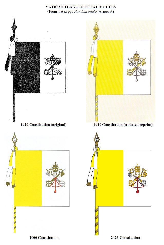
> La bandiera della Città del Vaticano è costituita da due campi divisi verticalmente, uno giallo aderente all'asta e l'altro bianco, e porta in questo ultimo la tiara colle chiavi, il tutto come al modello, che forma l'allegato A alla presente legge.
> Lo stemma è costituito dalla tiara colle chiavi, come al modello che forma l'allegato B alla presente legge.
> Il sigillo porta nel centro la tiara colle chiavi ed intorno le parole « Stato della Città del Vaticano », come al modello che forma l'allegato C alla presente legge.
Translated by Google:
> The flag of the Vatican City is made up of two vertically divided fields, one yellow adhering to the hoist and the other white, and in the latter bears the tiara with the keys, all as in the model, which forms attachment A to this law.
> The coat of arms consists of the tiara with the keys, as in the model which forms annex B to this law.
> The seal bears in the center the tiara with the keys and around the words "State of the Vatican City", as in the model which forms annex C to the present law.
From [1] – where the models in the annexes are printed in black and white.
Getting pixel-perfect representations from textual descriptions seems like a fool’s errand. The original sin, of course, was depicting the coat of arms on the flag, although that seems to be long practice for the preceding flags of the Papal States and institutions, as seen in the linked digital book on Vatican Flags [2] in the article, which features a multitude of different ancient depictions of the flag, often displaying the Papal Tiara’s inner lining in … red.
The illustration of the coat of arms is more helpful than it may appear, because it uses the heraldic conventions for indicating colours in engravings: the field (background) is gules (red), indicated by the vertical hatching; the keys are or (gold) and argent (silver) indicated by spotted hatching and plain white.
This feels like the author jumped to the conclusion that Wikipedia was at fault because it's a common enough story and sounded good, but it doesn't add up. See addaon's comment for an explanation of why heraldry here isn't as cut-and-dry as we're used to for, say, the US flag.
But even aside from that, the author neglected to check the full edit history on the Wikipedia file: the very first version of the flag (25 Nov 2005) had the red tiara that the article decries, citing Open Clip Art as the source [0]. That suggests the "wrong" version was already highly circulated before Wikipedia got the image.
The caption on the main photo goes so far as to suggest that the Vatican itself is using Wikipedia as a source for printing its flags. Indeed, the UN has a photo of the flag of the Vatican shortly after it was raised there in 2015, and that flag has the red tiara [1]. It's hard to imagine the flag flown at the UN being done as a rush job from a Wikipedia article.
It's a cute story, but it looks like the simpler truth is that the Vatican doesn't particularly care about the coloring of the tiara.
EDIT: Kudos to zokier for finding a Twitter thread with more examples [2]. Apparently the flag taken to the moon and back by Apollo 11 had the red tiara.
Yeah, what this really shows is that flags are not nearly as precise as we sometimes imagine them to me.
For instance, most old heraldic crests and flags have their official formats described in plain text: "Blazon or, three lions passant guardant azure, langued and armed gules." That's the final word on the matter. It's then up to the flag maker to read that and create it correctly.
This can result in flags that look subtly different, with variations in how lions or whatever were drawn. Google "Royal Banner of Scotland" and you'll see a number of variations in how the red lion is drawn. Ditto, say, "Coat of arms of Finland."
These days those Google searches will show more and more the same images, with the Wikipedia effect (or general internet) but you can still find a wealth of examples of how different they used to be.
> It's hard to imagine the flag flown at the UN being done as a rush job from a Wikipedia article.
Maybe the UN has their buttons on, but at the Olympics, displaying the wrong flag, an incorrect flag or the right flag upside-down happens now and then.
I imagine so, but in this instance the flag is a big stinking deal because the UN had just allowed the flags of Palestine and the Vatican (Observer States) to be flown for the very first time. This wasn't a case of "we've got to print out flags for every single country and fly them all at once", these two flags were given special attention.
Also note my edit: the Twitter thread zokier found shows Benedict XVI seated next to a red-tiara'd flag in 2005, as well as the one that was sent to the moon in 1969.
> Kazakhstan won the game but lost the award ceremony. A parody of the country's national anthem was played by mistake after a Kazakh athlete won a gold medal. Organizers of the shooting competition in Kuwait are apologizing for playing the Kazakhstan anthem from the comedy movie Borat.
Having just read a bit about what the heraldry rules are and the purpose they serve, it strikes me as very similar to the design ideas of transit maps in modern times. You want the lines to be easily distinguishable, certain colors shouldn't run side by side (so the conventional wisdom says), you choose only from a minimalist simple pallet. In most places, the maps are diagrammatic, the lines can be arranged in any way so long as they connect the right stations in the right order. Convergent evolution.
> It's hard to imagine the flag flown at the UN being done as a rush job from a Wikipedia article.
After working years for a famous international company where anyone from the outside would imagine incredible efficiency, precision, mastery, etc., it is really not hard AT ALL to believe.
They link to this dude’s Vatican flag site [0] that has the 2023 version [1] which is a mix of the "correct" (it might be the correct pre-2023 version) and "incorrect" version (2023 seems to have yellow, not bronze, keys, white tiara). I’m left with still not knowing what the real flag is, if Wikipedia is now right, and why the article writer wrote so much without doing any real research.
> It's hard to imagine the flag flown at the UN being done as a rush job from a Wikipedia article.
I imagine, given enough time, graphical equivalent of citogenesis[0] might kick in. Even assuming that, and that in a hypothetical reality, the Internet somehow confused both the UN and Vatican officials as to what the Vatican flag was, at some point you're better off just making it official and letting kids 50 years later have a laugh when learning about it on history lessons.
> So its obviously not just wikipedias invention, but a wider phenomenon.
That doesn't make a difference, IMO. There were all sorts of wrong statements before wikipedia, but it wouldn't reflect well on wikipedia if they presented them.
You didn't even bother following the link to the Twitter thread.
The photo of the Apollo 11 display shown in the thread was taken from Wikimedia Commons, uploaded in 2008 [0].
The other one, with Pope Benedict seated next to a red-tiara'd flag comes from archivio.quirinale.it, the official archives of the Italian presidency [1].
A similar scourge of mine is Wikipedia contributors helpfully "tracing" company logos so they can be uploaded as vector graphics (great in theory!) but introducing all kinds of mistakes in the process or using the wrong fonts... also causing the wrong logos to spread all over the internet.
That's the punishment companies get for not providing their official logos for download in an easy format without fuss.
If you have a startup, have a "media kit" page with all of this stuff. Logos for black and white backgrounds in open vector and raster formats, founder photos, bios, company intros, product photos, video clips of your product that you're okay with media cutting up and using.
Ideally, your logo in your website should also be a SVG or at least a transparent PNG. I definitely pick it up from Wikipedia when I go do a presentation if it's not there.
A lot of companies release press kits for proper usage of their logos without necessarily transferring the IP. I imagine in a lot of cases (including Wikipedia) it falls under fair use -- ultimately the logo is still trademarked.
In particular, as well as the obvious "can't copyright a circle" concept, wordmarks often don't qualify for copyright. Even if the typeface is copyrighted (as many are), that doesn't transfer to writing in that typeface. As usual, exactly where and to what extent that is true can vary around the world.
Trademark rules still apply, so you still can't take the Google wordmark and slap it on your company even if the logo is on Wikipedia Commons.
There's also nothing stopping the company itself submitting the correct logo. While, as far as I know, it's usually considered a conflict of interest to directly edit your own article as an organisation, you can upload the logo and request on the talk page of the article that correct image be used.
It becomes worse as you move further away from Anglosphere: according to Wikipedia the ancient Korean kingdom of Goguryeo has a forked red/yellow flag, but AFAIK that's total fabrication, based on a single mention in the record that said "Some troops of Goguryeo used red flags."
If I were still in my 20s I might have fought Wikilawyers on this. Now I'm old and I have enough shit to take care of. :/
Did you find sources and make the edit? Or just assume it would be rejected?
In my experience, the vast majority of my edits were accepted when properly sourced, especially on esoteric topics like this. Yes, there are exceptions and bad apples in the community. Those get a all the attention and media coverage but I've only encountered them on heavily edited and visited pages, not the more rare academic or historic pages. While it's anecdotal, I just checked and I've clocked nearly 800 edits in the past decade.
I would be more charitable if it wasn’t for the fact that 99% of all claims of misdeeds on Wikipedia never give any links, or even sufficient details to find the offending edits.
Who knows? Maybe the edit will stay, maybe it won't, but the very fact that the flag has been staying for years doesn't bode well for my effort. There are millions of Koreans who can write passable English: if it were that easy to remove the flag, someone would have done it.
I suspect there's a much smaller number who affirmatively know that there's not a specific flag for a kingdom that ceased to exist 1,335 years ago. Particularly since the article presents both a pure red flag and the red/yellow flag and claims they were used at different times.
Thus I'd imagine that of the small number of people intimately familiar with Korean history who even noticed, very few could say with sufficient certainty that the flag was never used.
Wikipedia is too often the final source of truth for people. While I'm not saying it's intentionally wrong very often, but accidental wrongs get repeated elsewhere. It happens especially with things like the Vatican flag ("Surely Wikipedians haven't fabricated some alternate version?").
Another example: The Windows Me logo (yes, seriously). At the bottom of the stylized "Me" are the words "Millennium Edition"; Wikipedians like to recreate logos into vector format. Unfortunately, someone had misspelled those words to say "Millenium Edition" instead. I personally fixed that image, but I still see the misspelled version crop up from time to time in articles, YouTube videos, etc (how are they still getting the wrong version? I don't know...).
I'd be willing to wager there's an endless discussion on the Talk page about this, where someone is arguing that the Vatican is wrong about their own flag, and they should be the ones to change.
When our local fire department got a new fire engine the manufacturer placed the coat of arms of the town on the door. But instead of getting it from the municipality they used a grotesquely wrong version from Wikipedia.
Wikipedia had Brigham Young University listed as Michael Jackson's Alma mater for a year.
The article on George Galloway, lists more lies and propaganda than a German speech, and they have NO plans to remove any of it.
Wait until you see the article on the IBM PC. Wow.
"Wikipedia was at fault."
They are never at fault. They just host the largest collection of loud mouth opinionators on the planet:
I have absolute an irritable proof: Hit random, until you find an article about, say... something you know about. Find the first error. Point it out in the talk section, and watch it get shot down.
I have drive-by-fixed many articles, including controversial ones like the George Floyd one. What I did was fix it, then post on Talk page with details. Looking through, it appears that most of the fixes remain. For the ones that don't, the precise language no longer appears but the article has since been written over the years since, and the fix is no longer necessary since it is correct.
I've noticed that I easily succeed at things many other people have real trouble with, this kind of thing included. It's a pity it's not particularly monetizable at a good rate, or I could simply launder other people's solutions through me. Maybe I, or a friend, can take a look at Galloway some time this week.
What happens when you just change the articles, and include a supporting citation?
In the case of genuine errors, is there anybody actually arguing on the other side?
I understand debates about whether or not things are worthy of inclusion (like unproved accusations), and there's a whole separate category of controversial viewpoints, but I've never come across meaningful pushback on unambiguous factual errors. You should just be able to fix things. I've certainly done so many times in the past, and I've never gotten anything "shot down" at all. In my experience, factual corrections get zero pushback because why would they?
I don't really understand complaining that people aren't fixing errors on Wikipedia if you aren't fixing them yourself.
Also, what are the dates that Brigham Young was added and then removed from the Michael Jackson article? Vandalism happens all the time but I'm pretty shocked that could stay up for a year. But I can't find any reference to it on the internet aside from your comment here, and WikiBlame isn't finding it either (looking up "Brigham" starting from Jan 2001 yields "Your search term was not found at all. Check the settings and try again." but maybe it's broken?)
> In the case of genuine errors, is there anybody actually arguing on the other side?
Oh yeah, that happens if your edit goes against one of Wikipedia's sacred policies (they all are). I have that issue on the Dutch Wikipedia where a number of places in the bilingual province of Frisia shifted their official names to the Frisian variants instead of the Dutch, and where in one case in the course of three decades the old Dutch name dropped out of use completely¹ except for… Wikipedia, which relies on a single outdated (or misinterpreted) document published by the national language society. That Wikipedia branch has a policy which mandates the use of that document, so even though it is demonstrably showing an obsolete name, Wikipedia editors who like that status quo (often due to a dislike of regional languages and identity — this will be familiar to Welsh and Catalan folk too) will defend those 'facts' and slap anyone suggesting change with that policy document.
To my estimate changing a standing Wikipedia policy requires being a high-profile editor for at least a decade and investing around twenty hours a week for about half a year to garner enough support to change it. Most people just consider the Dutch Wikipedia a lost cause in this regard and give up. What's annoying is that Wikipedia is often taken as authoritative in terms of simple facts (like in the case of this flag), and factual errors leak out across the internet.
1: That is, you won't find the old names in the place itself, nor used (in Dutch, or any language) by the local residents, nor on its signage, nor on its municipal website, nor in the local media (or even national media mostly), nor on most maps, et cetera.
From the talk page of George Galloway: " Currently the article stands as a detailed report of every accusation upon the person. The article should be shortened by removing allegations which have proven not true. The article gives much more focus to negative allegations than is normal for article on a person and reading it, portrays a negatively biased picture of the person. " clearly against their policy of bias, with nothing being done, except to bias it further.
There's a special place in hell for the Vatican. Pedo gay sex galore aside, the entire multi-billion dollar scammer organization, is disgusting. Went to visit while flying through. There's a long line in the square, it's sun-baking weather outside. They have the little roof-covered column things on the side, but the line is in the middle. No little tents over the line area - go ahead and stand there for 3 hours, at the zenith, in the middle of summer.
Well, burns and skin cancer, like tears inside the butt, bring you closer to god, as mother teresa always preached while on the scammin' trail, so all good - right? Nope, it's a sales tool. For a mere 300EUR you can bypass that line, and they have extremely rude and pushy sales people approach you multiple times as you suffer.
I gave up after 10 minutes. I took a selfie at their post office, now have a better story to tell, and my man-man virginity preserved. Although I probably would have been safe inside there, as I am an adult.
The special place in hell for that wiki editor, is called The Vatican. That whole area, the organization, and the people in it, are the definition of true and pure evil.
This raises deep philosophical questions about the nature of truth as it pertains to flags in particular.
If everybody is using the wrong flag in real life (well, ok, online) while the correct flag is merely a blueprint, a shadow projected inside Plato's cave, what is true and what is wrong?
I think this was a very specific case of someone editing an image and introducing a mistake. Experts knew what the real flag should look like.
For example, if the name on my birth certificate is Steve but my forgetful friends keep calling me Bob, my actual true name does not change regardless of how many people say my name wrong.
To be fair, the wrong version is just a recolor and is more visually pleasing. The “red disk” is the inside of the tiara and makes the 3D shape more recognizable than the white version.
I see the correct one, and it hasn't changed since 1 January.
Regardless, that edit history is interesting because it suggests that the mistake (if it is one) goes back way further than Wikipedia. The very first upload (24 Nov 2005) had the red tiara, and was added with this comment:
> Flag of the Vatican City from the [http://openclipart.org/ Open Clip Art] website. {{PD-OpenClipart}} Category:SVG flags
Turn out I am just blind and had the wrong hue of yellow in mind.
But yes, it's quite interesting to watch some of the flag pages. Vexillologists constantly fighting over the correct flag.
One of the recent ones fixed was the Imperial Japanese flag. Watching that flag flip flop between 4 or 5 different iterations was amusing, to say the least.
Wikipedia currently shows me the version with the white disk in the papal tiara, which the article asserts is the correct one. https://commons.wikimedia.org/wiki/File:Flag_of_the_Vatican_... suggests it's been that way since the 1st of January this year.
Holy Roman Empire really doted on those heraldic signs, with England and a few others, too. In German, the word for the heraldry banner is "waffen" which is the same word for actual weapons. In English, to say "Coat of Arms" says the same thing, if I understand it.
The german word for coat of arms is „Wappen“. Etymologically that word is descended from „Waffen“, although the difference happened in the high middle ages.
That's because originally they were arms - it's how combatants would identify who was who on the battlefield based on what was painted on their shield and helmet.
“Arms” has the same two meanings as in German (see e.g. the College of Arms — hint: it’s not a place where they teach weaponry). “Coat” in this context refers to the actual coat worn by heralds representing the sovereign. The modern word for that outfit is “tabard” I believe.
There's a similar issue with the Mexican coat of arms in Wikipedia.
The Wikipedia eagle has black claws and red eyes but the official one doesn't. [1][2][3]
One time I tried to fix it but I don't know how to use Inkspace and it turned out to be trickier than it looks. I naïvely hoped I could just fix it with a bucket tool but it's not as simple, lol.
> I naïvely hoped I could just fix it with a bucket tool but it's not as simple, lol.
It's way simpler than that: open it, click it; you'll see everything is selected, so it's grouped (also visible in the status bar that describes the selection). Double click to enter the group; now you can select the correct shape. Once you have selected the shape you want to change, you can change its color by using the color bar, or bring up the color selector (from the UI, background and outline, or Ctrl-Shift-F).
However, I'd be cautious before modifying it. Do you have a better source than these for the colors? Ideally, in writing.
I can see some red eyes and black claws (with a central gradient similar to the one on the prickly pears) on your [3], which is closest to the Wikimedia image. The other two images have different colors and shapes for a lot of elements, including the plants.
I’m not taking a side on any issue at all, and definitely not this one! Just a funny observation about how something could go undetected on a wiki. I’ll go as far as a joke postulate:
“For any given page on wikipedia, the people with the most personal experience (as distinct from ‘knowledge’) will be the least frequent visitors to that page.”
Or as it was later to be summed up, “so… you thought doctors were the ones searching for ‘doctor’ on the internet?”
I guess the edit war would need to be conclusively resolved before the Wikipedia page is update to reflect it? Wikipedia proceduralism is always confusing to me.
The article uses the USA flag as an example of how to precisely specify a flag, but the USA is one of the countries which does NOT define its flag in any precise manner, to the point that different US agencies use different flags (Most noticeably varying in color).
I don't know if you were trying to use it as a source for your claim, but the video you linked does describe and link to the exact textile color specification from the US government.
For textiles, but not print or computer screens. Also, it is a GSA guideline for use by US government agencies themselves only (along with quality standards when the federal government purchases things from private vendors such as chocolate [1], but it does not define what can be sold as chocolate and what not, the FDA would define that [2]).
I’m really surprised that Father Becker thinks this is a meaningful difference. I’m as detail-oriented as it gets, but symbols on flags and coats of arms are a notoriously hard thing to get “right” and I’m not sure they should.
Noble houses had lions, dolphins, elephants, and unicorns on their coat of arms at a time when people (bored monks who never left their monastery) drew them like a confused alcoholic toddler, a dried-out octopus, a Shar-Pei with a snake for a nose, and nothing like a rhinoceros, respectively. (The last one was never really fixed and we stole the horn of a narwhal and made up a whole imaginary animal rather than admit we got it wrong. Still pissed that Scotland doesn’t have rhinoceros as a symbol because it would suit their nightlife so much better than a unicorn.)
This was so bad that people, at least those who cared about heraldry, had to agree that the difference between a lion and a leopard was that one was looking straight at the viewer and the other looked right (which famously is left because of how shields work).
This long introduction to say: Symbols have to be recognizable, but their specific design isn’t part of what makes a flag a flag. Yesterday, someone asked r/vexillology which one among 10(!) was the proper flag for the Isle of Man. If you haven’t seen it, it’s red (gules) with the symbol of the island, the triskele: “three legs in armour flexed at the knee and conjoined at the thigh, all proper, garnished and spurred”. I can’t imagine a more specific description, and yet: 10 different armours, feet extension, spurs… All valid, all different. Anyone who cares about medieval armours will tell you: the complexity of protecting a fighter in battle with 15th-century forging techniques makes vexillologists look like children playing with Duplo bricks in comparison. We are never getting a photo-exact triskele, not without going beyond what that symbol is meant to be: recognizable.
This hits personally because my family colours are extremely simple but impossible to draw: it’s “silver (white) with a brewer’s pole.” Sound simple? Yeah, if anyone knew what a brewer pole is meant to look like. I won’t bore you with emails with my uncles, but let’s say there’s a new version every time anyone responds. We’ve seen anything from a club, a broom, a rake to something that is best described as an old-school TV antenna.
I think some creative license is welcome in that case.
Since Pope Francis has rejected the heavy triple crown for a more symbolic tiara (a silver mitre with three connected golden lines, like this: 王). It makes sense that the flag has adapted, and some flags and some coats of arms in Rome have that design. But that (much bigger and symbolically enormous) inconsistency isn’t raised by Father Becker, who prefers to point out that, while every Papal vestment is coated in white, while personal effects are velveted in red, as the tiara is part of a sacrament… Sure, technically true, but this is a conversation about papal underwear——literally.
More generally the design of the keys, the flowing of the stole even the motif embroidered on it, all can be adapted without betraying who the Pope is. The only real things that matter are: having three crowns (or a liturgical equivalent) and that the two keys are of different colours.
For example, I’ve even seen one very committed designer change the colour of the stole based on the liturgical calendar (for the miscreants who are inexplicably still reading: stoles can be green, white, red, or purple, depending on the day or the occasion —— and nerds will add blue to that list). As absurd as the idea of a flag changing colour every day can seem, it makes sense. Can you imagine if the flag of your country had the tiniest difference if you were in mourning?
The carpet in the Oval Office has the Great Seal of the United States: the Eagle with the start-spangled shield. Famously, the Eagle looks left, towards the olive branch, to symbolise the country’s historical preference for peace. There’s a rumour that the carpet has another version: one where the Eagle looks right, towards the arrows, and that the carpet can be switched if the country is at war. I like that idea. Wikipedia editors might not appreciate the extra work, but I think that nuances like those make symbols more powerful. We didn’t just send a carrier battle group to your shores, we switched the carpet. This is not an exercise. It’s not technically true says Snopes [0] but if West Wing, Woodrow Wilson, and Winston Churchill like the idea, who could possibly disagree?
All that to say: you have the Great Seal in mind, right? Can you tell, without looking and with certainty, whether the nails of the talons (the “claws”) are yellow, black, or red? Would you consider that a mistake? Well, that article argues something similar and I’m not sure that it’s fair. I think we would be better served by an article asking if the Pope is king in Rome.
> There’s a rumour that the carpet has another version: one where the Eagle looks right, towards the arrows, and that the carpet can be switched if the country is at war. I like that idea.
In recent decades every president get’s his own rug with his own design [1]. It’s even more amusing, if you imagine a storehouse somewhere with the unused “wars rugs” of past presidents.
> the carpet can be switched if the country is at war
"There is a temple to him in Rome, which has two doors, and which they call the gate of war. It is the custom to open the temple in time of war, and to close it during peace. This scarcely ever took place, as the empire was almost always at war with some state."
Well the article does show a photo of the wrong flag flying at (or very near to) the vatican. TBH I think the incorrect design looks better! But I suppose that's beside the point...
On the other, claiming malicious intent is pretending the little flood fill is FAR more important than it really is. It's not the era of the crusades anymore, and realistically if this bothers anyone, the easiest solution is to just remove that flood fill from the official flag because a speck of red makes zero difference in recognizing a flag. We're not carrying them into war, and the Vatican sure as hell isn't funding any expeditions by the Doge of Venice to reclaim Jerusalem any time soon.
It's like someone getting the font for "California Republic" on the California flag wrong: no one cares except the people who shouldn't.
Fun fact: This also happened with the Austro-Hungarian monarchy for some time, where the civil naval ensign was communicated as the flag, compare [0] and [1].
It can be still found on Amazon, etc, as "Austria-Hungary Flag".
Mmmm, the Prime Example of color space hell. I'd bet these people never seen it correctly on monitor since I don't think any single of them ever had calibrated display (if i'm wrong i apologize). Pointless and priceless until it gets serious and then, wait for it, printed! Which is whole another step of brain-melting-difficulty in getting it correct. (wikipedia reverters [in this scenario] are) Laughable at least, thanks, made my day. The difference in versions from 2014 (compared to later ones) is completely hilarious. Enjoy while you can!
More importantly and amusingly the Vatican flag is square - [|] vs [ | ]. Your emoji viewer may render it wrong (check your flag section, iPhone gets it right) but don’t feel bad - most of the flags are incorrectly rectangle.
Wikipedia is trash, always has been. A small group of fanatics run that site and only allow information they deem acceptable. Using their information has always been a bad idea.
It used to have its own wiki article which was downgraded as the result of the lack of reputable newspapers making references to the Gell-Mann effect. Like if newspapers would ever push that concept in their columns...
It is amusing that an entity as obscenely rich as the Vatican isn’t providing official high quality images of their own flag. Maybe it isn’t as important in the grand scheme of things?
> It is amusing that an entity as obscenely rich as the Vatican isn’t providing official high quality images of their own flag.
The State of Vatican City wasn’t rich before most of its assets were stripped and transferred to the Holy See (which also isn’t all that rich.)
The Catholic Church collectively has a lot of assets, but the vast majority of them aren’t controlled by the Holy See (and even less are controlled by the State of Vatican City), they belong to individual dioceses or religious communities.
> Maybe it isn’t as important in the grand scheme of things?
Accuracy is hard. As with many things, the first 90% takes 10% of the time, the last 10% takes 90%.
Wikipedia seems filled with <90% accurate information, which is misinformation (or BS). I could imagine an obvious reason, that these volunteers with limited expertise and facility with the information (i.e., they aren't experts in the field who know all the sources well) write what they know. Also, it is up to Wikipedia's standard de facto, and most people don't go beyond that norm.
Instead of lots of people providing <90% accurate misinfo, we need a few people producing 99.999% accurate info. (Seriously, if you are producing <90% accurate info, stop. The Internet has infinite amounts of it, if there was ever a marginal benefit to it, we don't need more now.)
It's easy to copy and share accurate info, in theory, rather than creating or sharing more BS. The other problem is that such info is often placed behind paywalls; the intellectual elite get it, but not the public. If you want an accurate science info, look at McGraw-Hill's AccessScience (the decendent of their leading Encyclopedia of Science and Technology), "written by world-renowned scientists, including 46 Nobel Prize Laureates" - not exactly Wikipedia. Unfortunately, you'll probably need an institutional subscriptioin. Who cares if high school kids (or anyone else) have accurate info?
How is this Wikipedia's fault if the Vatican doesn't even make usable graphics of their own flag available? I suppose an ancient conservative institution like the Catholic Church failing to adapt to the internet isn't all that surprising, but you can hardly blame well-willing volunteers for the Vatican's lack of public information.
Not speaking Italian, and not having done the historical digging, I don't know the original written definition of the Vatican flag, but it looks like it's something like "banner divided in yellow (towards the flagpole) and white, with the white part centered with the crossed keys surmounted by the tiara," where the "crossed keys" and "tiara" are imports of external symbology. In this case, the question concerns the tiara [1] -- which, like most physical tiaras, has a hole running through it that appears neither red nor white when viewed as it is represented on the flag.
While it is certainly reasonable for the Vatican to have preferences on the detailed representation of this flag, both as-drawn versions are faithful representations of the blazon, both allow looking up the blazon from the visual representation, and both are, frankly, fine.
[1] https://www.vatican.va/news_services/press/documentazione/do...